Showing posts with label Researching Digipaks and Magazine Ads. Show all posts

Tuesday, 25 February 2014

Artist album influences for digipak

Kasabian 

Further research into Britpop examples has helped me come up with my digipak design. The characteristics these album covers share is the simplicity of the design. The Kasabian CD shares similarities with my current digipak by only using two colours. 


Blur 


The blur album influenced my first design ideas, which was to use photos of them playing live and make them cut out (abstract) in the four corners design similar to this cover. However, I scrapped it as I preferred my other idea. I still kept with the image of the band on the front, so then the audience can make the connection between their music and their faces. I combined features from each to end with my own design. 


Paramore


Away from Britpop to pop/alternative rock. The handwriting effect of the Riot! album cover is very similar to my font choices. They both mimic handwriting and the idea of a journal/diary type design for the CD. 


Previous Print Material Development: 
Font examples of Britpop (Slide 5) and text colour trials (Slide 4): Click here
Back to Blog index


Saturday, 7 September 2013

Digipak Research: Prog Rock - Collection

This digipak is different to the others, because it's a collection of Prog Rock. Prog Rock was big in the 70's which explains the surreal weird artwork. It's similar to Psychedelic Rock, because of the unusual concept in artwork. As it is a collection of different artists there is no identification of any specific groups. The mention of the bands are displayed in the booklet, which is very simplistic and standard. Unlike with the others dedicated to one particular band, the booklet has a description of the band instead of the lyrics. The songs tend to be very long and instrumental. 


Annotation: 


One song from the album "Focus" by Sylvia, it wasn't what I was expecting when taking the artwork into account, however it is instrumental dominant.

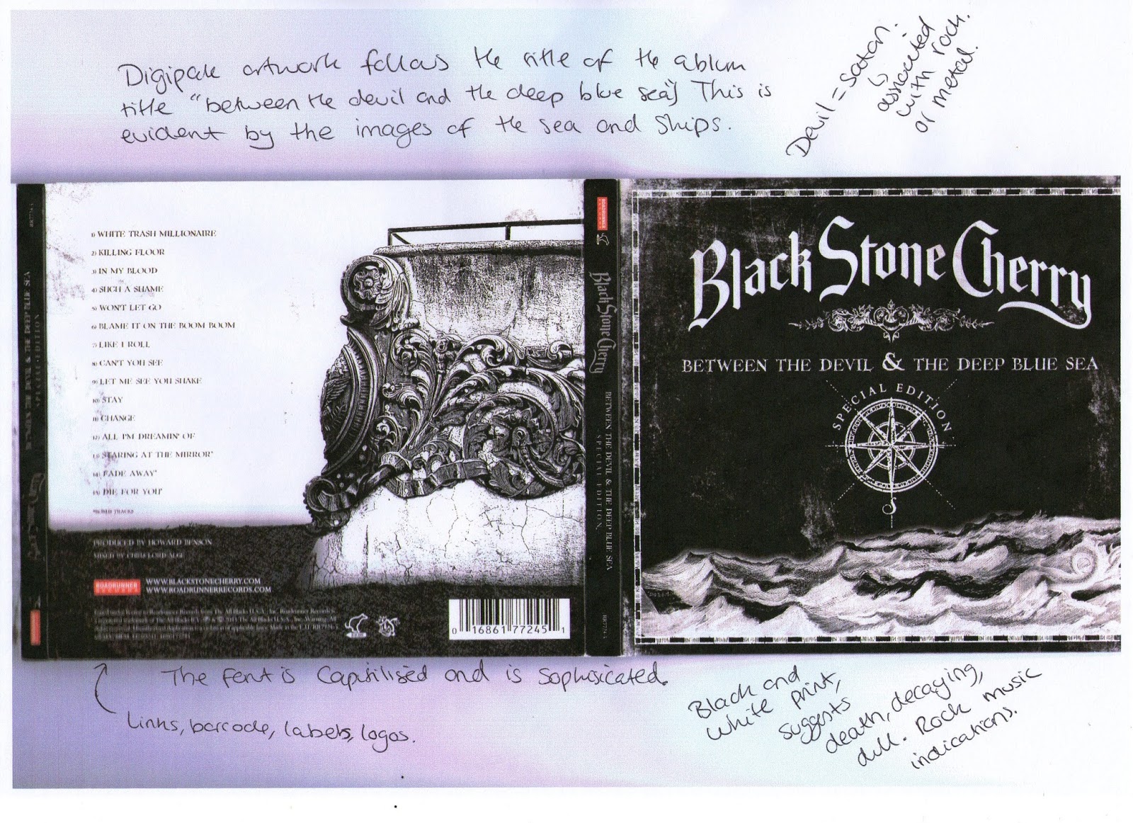
Digipak Research: Black Stone Cherry - Between The Devil & The Deep Blue Sea

Black Stone Cherry are a country rock band from Kentucky in the USA. This is their third album and since their second album they have become more popular with White Trash Millionaire being a big hit. "Between The Devil & The Deep Blue Sea" is dominantly black and white, with very little colour except for the picture behind the CD. The artwork follows the title of the album. The album does look like what their music suggests: loud, heavy and dramatic. 


Annotation: 


The album is more about expression and a story they want to tell. Their music is reflected well through the artwork and it is what you would expect.

"Such a Shame" 4th Track off the album, which proves my statement above.

Digipak Research: Eskemo - Eskemo 1.v1


Eskemo are a emo rock band from France. They call their genre of music Emotional Rock. Their first album is in a digipak form. From the annotations I have made, they have tried to identify themselves by having their picture on nearly every page of the CD case, because they are not well known and very young. Purpose of the artwork is to get them recognition as a group, because they are so young. Also being a french band they sing in french, which limits their audience range. They are confined when it comes to their economic success. 


The album design is primarily to promote themselves as a band, rather than expressing themselves.


 Annotations: 


Inside the booklet there is your conventional features of credits and the lyrics to their songs. The grey wall is a key feature on every part of digipak material (excluding the CD). Note: Digipak themes are always consistent. 

 
"Partie Terminée" is the main track of the album, it matches the expectation given from the artwork.
 

Digipak Research: Explosion In The Sky

Explosion in The Sky had a very creative digipak and was very interactive. The band are purely instrumental and their digipak artwork is very ambiguous. It is almost like it is telling you a story, within the house. It has a metaphoric meaning behind it, with the open doors and the overgrown plants. It leads to many interpretations.


Annotations: 


"Human Qualities" is one track off the album and is instrumental. You can imagine it from the album artwork.
 

Monday, 5 August 2013

What is a digipak?

Digipak is a style of packaging which is often used for CD singles or special editions of CD albums. They usually consist of a book fold style of either paperboard or card stock outer binding, with one or more plastic trays capable of holding a CD or DVD attached to the inside. Digipaks are nowadays very common and very popular, but originally first created by MeadWestvaco.

Digipak's benefit the artist through representation on the front cover and defines their genre of music. The digipak is styled to represent the artist and is very likely to show a theme or message as well as giving the artist another way to reach their audience through another creative outlet. All aspects of the digipak, brand image and music video are all combined together to create one solid representation of the artist and what they stand for.